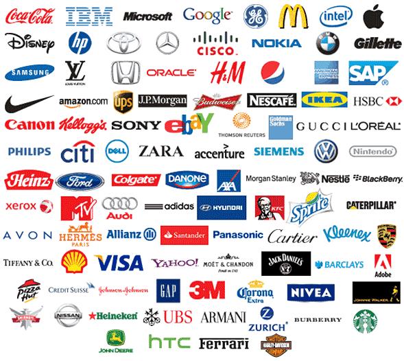
Logos are a brand’s emblem. From the dawn of time, we have seen some kind of ‘logo’ at play. Ancient tribes used symbols to mark their territory. Right up to this day, we have seen almost every single commercial entity use some kind of logo. Whether it’s a business, country, football team, band or school.
Logos are a kind of shorthand representation of a larger meaning. They should be designed to instantly recognizable, without having to read words. They should stick in the head and be very clear as to what they represent. Let’s go into what makes an eye catching, memorable logo.
Don’t Be Literal
The best logos aren’t literal. They are obscure. This makes them more eye catching, sure, but it also makes them more memorable, and stand out from the crowd. Look at some of the best logo’s in the world:
Look at the Nike logo. A tick. A widely known western symbol for ‘correct’. You don’t see them putting trainers in their logo, or clothing. No, it’s simply a tick. They don’t even need to use the word ‘Nike’ in their logo.
Here’s the Mercedes logo. No car in site. Just this iconic 3 point emblem in a circle. Recognisable anywhere.
Keep It Simple
The best logos are simple. Instantly recognizable. Look good in any colour. They should be easy to replicate with a pencil and paper. A company I use from time to time for various print and sign work, IVC signs (whom deal with putting logos on shop signs and vans all day long) always say the best logos are the ones they can replicate quickly without any need for intricacies. Some logo’s they have to deal with are large with real images in, or have 3D or glitter effects… eurgh.
Look at the Google logo. It’s just the word, Google. That’s how simple it is…
What logo blog post would be complete without talking about the Golden Arches. The McDonalds logo, simply an M. This is as simple as it gets.
Make Sure Your Logo Allows For A Shorthand Version
All the best logo’s come in 2 flavors. A longer version (which still should be short and simple) and a shorthand version, which is usually just a letter or a symbol.
For Nike, it’s just the tick. For Google, it’s just the G. For McDonalds, it’s just the M, or the ‘Golden Arches’. Look below at both of Face book’s logo ‘flavors’.
Here is the longer version of the Face book logo, which can be shortened down, to just the F, seen below:
You’ll want your logo to be able to be shortened down in the same fashion. Whether it is just a symbol, or a letter, it is very effective.
Make A Logo That Can Evolve
All the best logo’s evolve with the times. In the 90’s, things were all 3D. 2000’s saw logos being embossed. Now we’re into a flat-design era, with Apple’s new ios and Windows operating systems all adopting this flat design style. We have seen Google’s logo evolve over time, and Face book’s – but they have still kept their familiarity.
Take a look at this fantastic blog post about evolving brand logo’s. Do you remember any…? Did you even notice them evolve?
So how do you make a logo that can evolve? Keep it simple. Make the recognizable part of the logo something very, very basic. If it is the text or just a symbol, make sure it has the flexibility to be changed slightly over time as design trends move on.

