Ask condo owners what the biggest challenge is about vertical living and they will respond with one resounding answer: space. Every condo unit has predetermined dimensions that condo owners need to adjust to. Because of this, some outsiders are left with the impression that living in a condo is very limiting—there is almost no room to wiggle around, let alone make design improvements. The truth is, limited space is only a problem if you take it as such. But if you think big, you can turn things around and not let space govern your lifestyle. It’s all a matter of changing your mental and visual perception. By using a smart interior design, you can control how much space you get out of your condo.
Go Light: Heavy Colors are a No-go
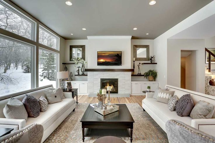
You can learn so much about how to make your space look bigger from interior designers. The first thing they would tell you is to change the colors in your condo to monochromatic hues. Light can’t bounce on dark colors, so your condo feels smaller when your walls are painted dark. Better stick to white, light blue, cream, gray or beige to keep your condo looking airy and spacious.
Hang Mirrors: Reflection is Key
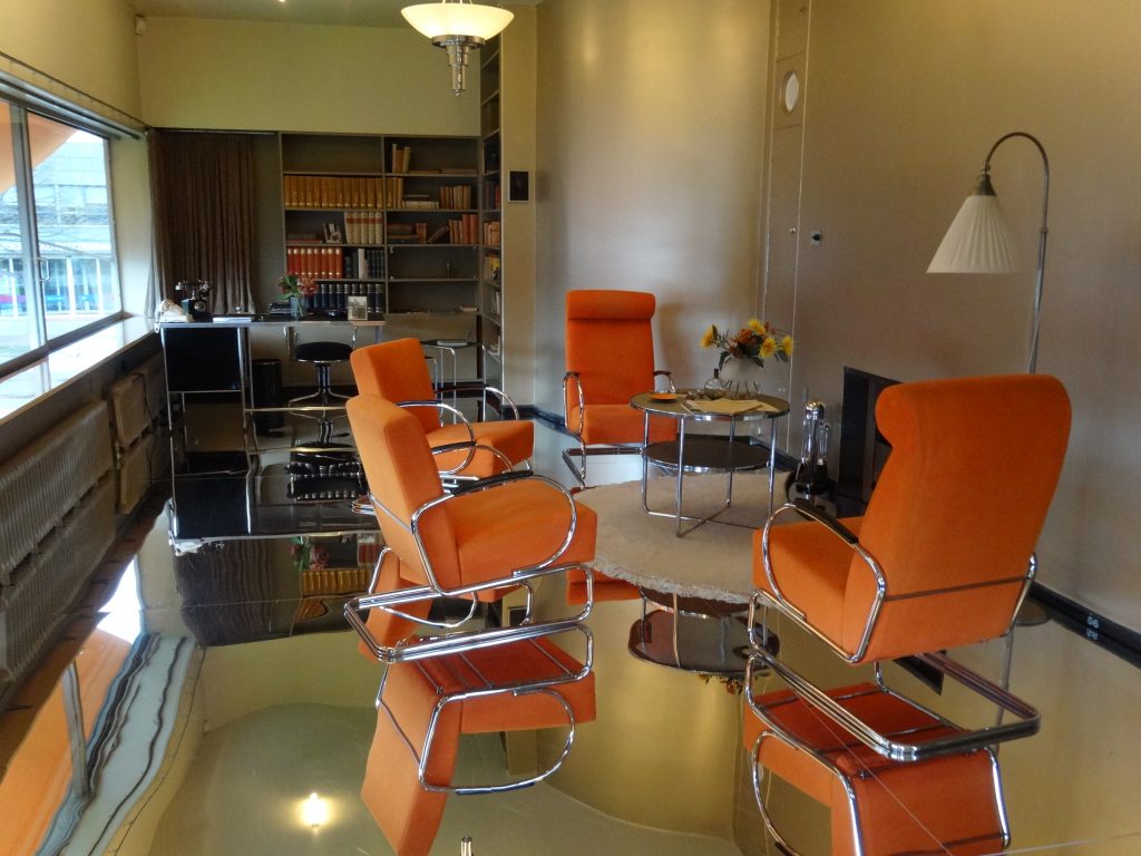
Reflective surfaces, when placed strategically, can create an illusion of wideness. Decors made of glass and acrylic can make a room look larger than it really is. Mirrors are the best materials for creating this effect. The mirror, like any major design element, should complement your furniture. Ideally, the mirror and sofa should be asymmetrical in terms of shape, size, and position.
Get Rid of Clutter: Minimalism is the Way to go
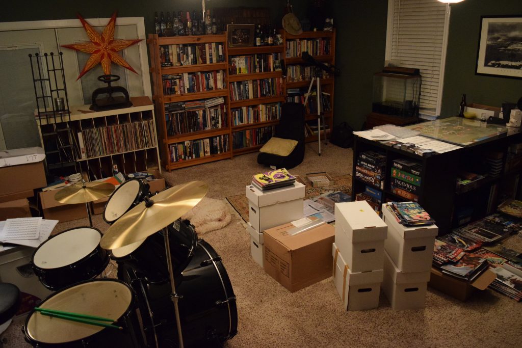
Maximizing condo space will be all the more difficult if you don’t get rid of all your junk. So much space is wasted because it’s taken up by useless objects that you’re always too busy to clean up or organize. By disposing of your clutter, you’re setting yourself free from irrational material attachment. Your old possessions are better off in the hands of other people who will find them useful, so don’t feel bad about donating them. If you’re more business-minded, you can even sell them. Just focus on giving your condo more depth by getting rid of unnecessary things that take up space.
Use Every Corner: Space is a Luxury
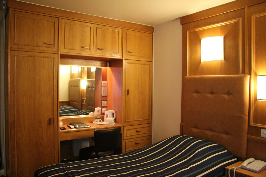
This point doesn’t have to be repeated, but its importance needs to be emphasized. Every space, every corner, and every nook matters in the small living space that a condominium provides. There is no room for idle furniture and no place for dull designs. You need to pump life into your unit if you want to make it appear lighter and sizable. Every corner should have a striking purpose.
Maximize Lighting: Define the Mood
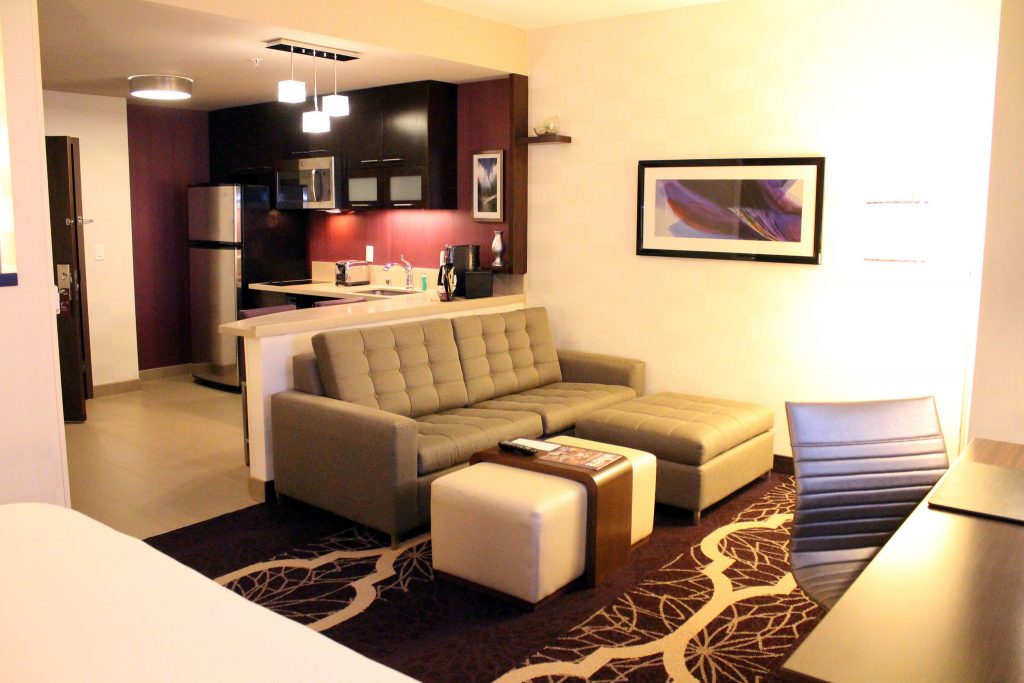
Any space, no matter how small, can feel larger if it has an inviting aura. No design element sets the mood better than lighting. There are many aspects of lighting that you need to learn to fully master the illusion of space for your condo interior. The type and color of a bulb to use are one thing, the kind of lighting fixture to install is another. Even the placement and the angling of the light fixtures can help you strike the perfect mood.
Open the Shelves: Show them what you’ve got
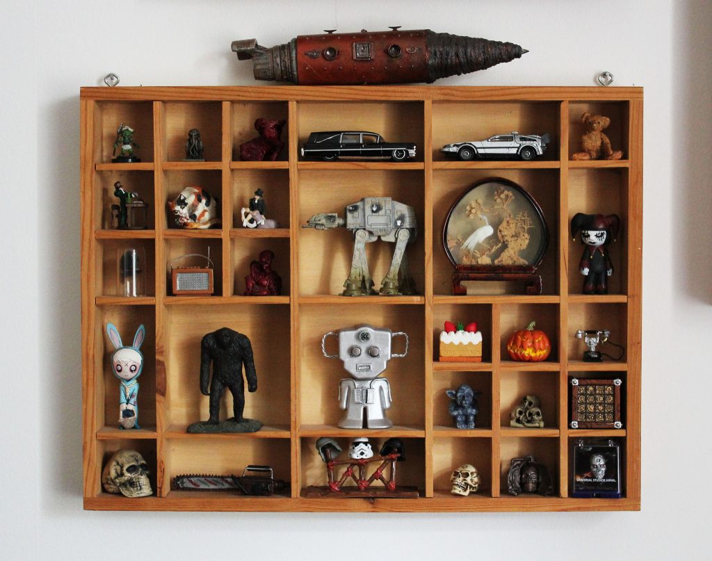
The more closed doors, windows, and cabinets you have, the more cramped your condo will look. Balance is an important factor in making your condo look more spacious. Invest on floating shelves that display your important possessions like books, antique pieces, and music collections. Just make sure that their colors don’t contrast with the general character of the room.
Choose Dual: Furniture must have at Least Two Purposes
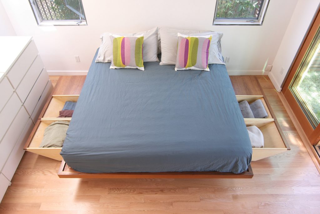
Tables shouldn’t be mere tables. They should come with a storage space where you can put away small trinkets. Sofas shouldn’t be mere sofas. They should double as beds if needed. Wall paintings shouldn’t be mere wall paintings. They should reveal a hidden space.If you really want to maximize your condo space, invest on multipurpose furniture.
No to Ruffles: Opt for Clean Lines
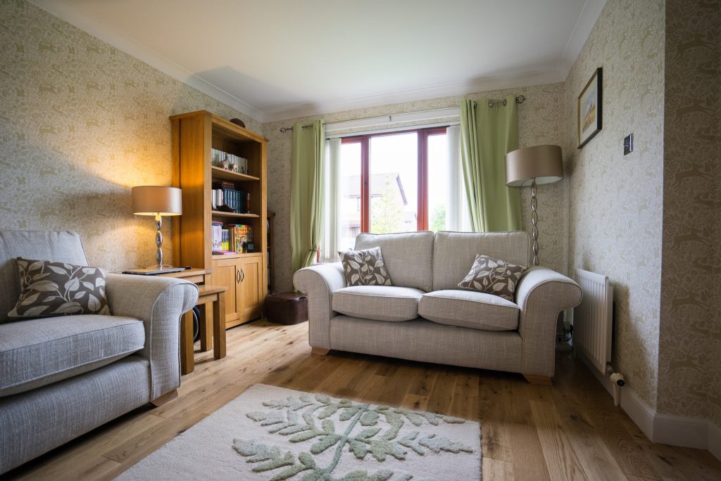
IMG Source: Lee Simpson
Ruffles and other unnecessary details in the furniture only give the room a heavier look. What you want is to create clean lines in every room of your condo, and that includes the details in the furniture. Opt for simple designs that stand somewhere between bare and intricate. Use either plain fabrics or textiles with minimal designs. They will make the room look less cluttered.
Open Windows and Doors: Own the View Outside
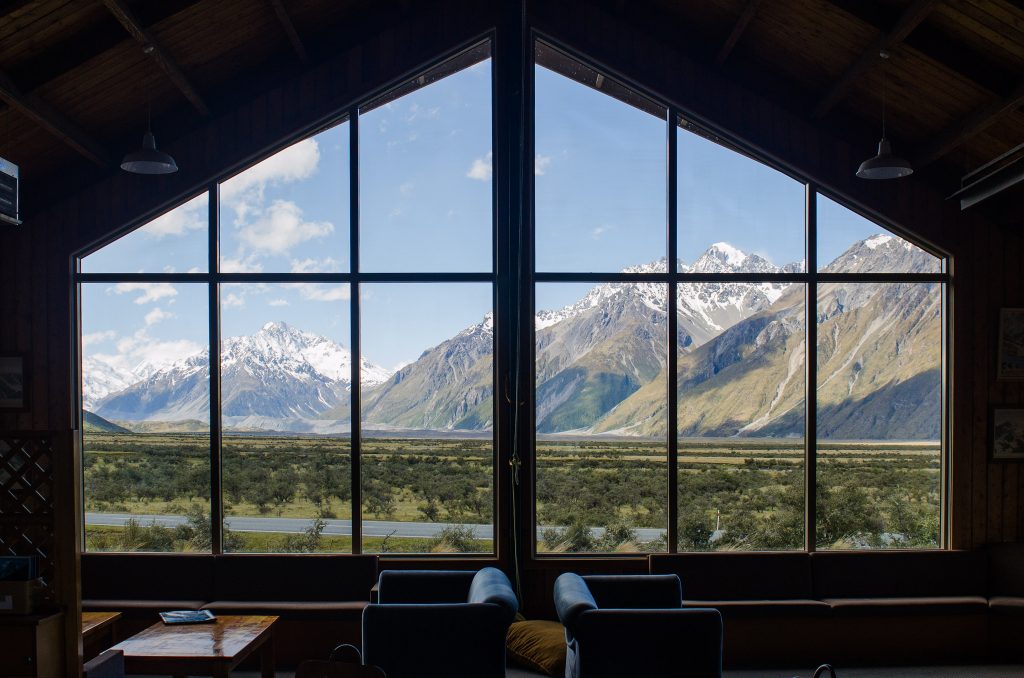
This doesn’t mean that you should always keep your doors and windows open. Obviously, that won’t be ideal for security reasons. What this means is for you to let your windows be windows and your doors to be doors. Don’t cover the windows with drapes, if you can help it. However, if it’s absolutely necessary for you to cover them, go for light-colored blinds. As for doors, as much as possible use pocket doors instead of the heavy ones. The farther the eye can see, the better the illusion of space works.
Layout Wisely: It’s All a Matter of Design
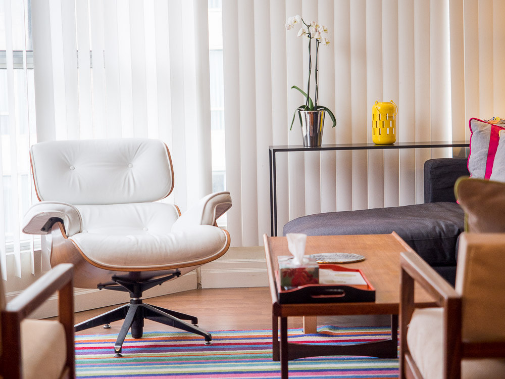
Ultimately, it boils down to how well you arrange your furniture so that they all make sense. Every room should have a sense of unity—the furniture should be where they are for a reason. When a visitor comes, he or she should see the focal point of the room right away, and that focal point shouldn’t be contradicted by the other elements in the room. Keeping all furniture against the wall doesn’t guarantee the illusion of space. It’s the angling that gives balance and unity.
See? Space isn’t really the problem. There’s nothing a good design can’t fix. Just remember to follow the interior designer in you every time you’re tempted or get frustrated. Remember: space is a matter of perspective. Choose to think big.

