The smartphones have summed up all the technology on our fingertips. With just the tap on the screen of a mobile, we can do those things which were nearly impossible to do with such ease. That is why every business now is dying to make a strong digital presence. For this, businesses are getting the help of web design company UAE and reaching out the masses through a computer and mobile screens.
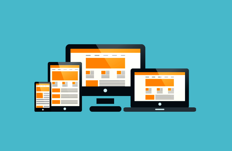
But designing a website is not as simple and straightforward. It is either about a responsive web design or adaptive web design. To clear out this fuzz, I am writing this post in which you are going to find few important points regarding responsive and adaptive web designs and which you should choose.
Responsive Design:
Responsive design is the most common term in web designing. It can be defined as the changes in the page size to adopt the resolutions of different screens. For this, the web designer uses CSS media query, Content-Based Breakpoint and other technologies. To help you in understanding responsive design, just zoom in and zoom out the screen of the browser from the settings. If you see that the contents of the web page are rearranging itself according to the pixels limitations, then this website is a responsive one.
Pros and Cons:
The responsive websites usually build on the seamless design with the great user experience features. Due to its demand in the market, there are numerous templates which you can use. With the search engine optimized features and quite easy to amend or alter, the responsive websites are necessary for better digital marketing. However, it sets itself automatically according to the browser screen, it does not allow you to keep a control over the content. The elements start moving around and also takes more time to download on mobile screens than other types of web designs.
Adaptive Design:
Unlike the responsive design where the content adjusts itself according to the screen size, by opting the adaptive design, a designer has to make a separate web page for each standard size screen. Whenever the URL load regardless on which browser, it analyzes and identify the size of the browser’s screen and choose the right or the best-sized web page before loading. For the sake of example, if you find any website’s content which is still or not changing according to the size of the browser screen, then you can identify that the designer has to use adaptive design in it instead of going for responsive one.
Pros and Cons:
The adaptive designs also share the good UX feature with the responsive design but it gives more control to the designer on the UX then in the responsive designs. On loading mobile or other sized screens, it adopts the environment and only loads the ideal web page on it. Another great perk of adaptive design is the control over advertisement plan. However, building adaptive designs take much longer time than responsive and it can also make or break on the devices which constantly change screens.